18 October, 2010

Belle Blues...


Katherine Rally Textiles - Napkin in Midnight
As many of you already know - I'm a real sucker for almost anything 'blue' particularly this fresh 'delf' blue combined freshly with white, in bold & smaller prints - spots, and stripes! The clean fresh simplicity of a blue print on a white, off white or cream base is unmistakably elegant and contemporary to any colour scheme.

Here in the recent issue [Oct/ Nov 2010] of Belle magazine is a harmonious smattering of hand-block printed fabrics from Ralph Lauren through Radford Furnishings, Raul Textiles through Garner Agencies, Les Indiennes by Mary Mulcahy through Diane Bergeron; and Martyn Lawrence-Bullard through Garner Agencies.
But if you want to get your hands on some divine hand block & screen printed fabrics, pillows and tableware check out Katherine Rally [Textiles] - I have fallen in love with their bold, beautiful - 'Regency South-East Asian' inspired prints and can't wait for an excuse to use them with a client....maybe my new client would like to use these in their bedroom, living room & outdoor space! For more on Katherine Rally head to the dynamic duo's website HERE.
Happy Monday - Hope you have a wonderful & Palatial day! S x
Katherine Rally Textiles - Monaco Pillow in Midnight
Katherine Rally Textiles - Rebecca in Powder Blue

Katherine Rally Textiles - Garden Gate in Classic Blue

Katherine Rally Textiles - Sassa in Midnight  Blue


17 October, 2010

Sunday Roses...

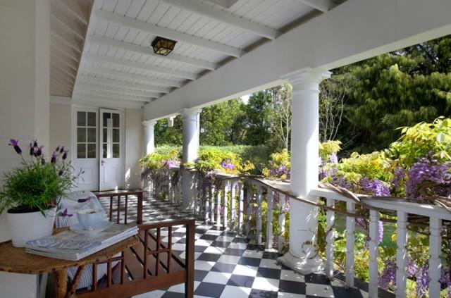
I managed to get some photos in the glorious Sunday morning light today of the stunning Iceberg Roses that have really been in full bloom mode this week. Where I thought I had about 20 heads, there seems to be so many more again! These roses are the ones I mentioned on Friday's post - they have just gone crazy with this wild weather we have been experiencing in Sydney - the rain, the wind, and then the warm sunny weather we've now got back again! They're such a lovely peaceful pretty greeting at my front verandah. Hope you had a great weekend! S x


15 October, 2010

Happy Weekend...


Happy Weekend! My iceberg white roses have just started to bloom near my front door and they must be more than twenty heads ready to open! Hope you have a wonderful time over the weekend...
Thank You for visiting me this week at Palatial Living.
Enjoy & Take Care - S x


image via tumblr

Trends for Tomorrow Part II...

 
So now for Part II from the ISCD Trend Evening 'Tomorrowland', and this part looks to the fabulous 100% Design London 2010& London Design week [exhibits]. I have create more of a bulleted list for you with all the links included so that you can indeed go on your ON trend & design hunt through these talented designers & artists. These trends are not the ones that I believe that it is so important the the interpretation of these trends is yours - and it really does come down to how you put your own spin on these trends and how you can incorporate them into your design work whether is be at home or with a client.
  
Here are some Key Areas that were identified at 100% Design London 2010/ London Design Festival.
  • Achromatic colour palettes - using lots of Greys & Blacks - shading & tinting
  • The juxtaposition of Old & New items, materials and surfaces
  • A wide use of Timber in Natural and Neutral stains or left unfinished
  • Unfinished treatments of timber & surface tops - being exposed to use and elements - thus creating scratches and marks - memory mark making.
  • The idea Raw and keeping colours and surfaces in a raw state - introducing hues of Orange & Terracottas as an accent to the Achromatic colour palettes - using real Earth colours to complement the unfinished treatments.
Achromatic colour palettes
    

Achromatic colour palettes with accent of orange

Ikea's answer to Achromatic colour palettes

  • Botanic Nature Trends
  • Bold use of colours especially with Greens/ Purples combination
  • Vibrant, High Value Hues
  • Grahame & Brown Wallpaper
  • Pieces by Erica Wakely
  • Reuse is the new trend in the sustainability race
  • Orchard Studios - flat pack chair rubber band chairs
  • Design with a low carbon foot print
  • Rubber bands & using recycled materials in design

Orchard Studios - flat pack chair rubber band chairs
 
  • Straight edge furniture
  • Dare Studio
  • Check out works by Edward Robinson
  • Handmade [made by hand - not mass assembled] products
Edward Robinson - Bramcote

Edward Robinson - Bramcote

Edward Robinson - Harbour Chair

Edward Robinson - Harbour Chair

Edward Robinson - Harbour Chair designs

  • Lighting - handmade designs/ bespoke
  • A movement back to the hand crafted
  • Check out pieces by Esther Patterson - Curiousa & Curiousa- Intertwining designs and motifs inspired by childhood memories with a love of form and function, Curiousa & Curiousa challenge perceptions of comfort and beauty, creating individual, hand-made lighting, furniture and pattern design. Applying traditional techniques for a modern age, Esther Patterson, the company founder, is a maker who is committed to working with UK suppliers and other crafts people, from hand-blown glass and bone china lighting to bespoke upholstery and furniture production.
  • Lace cut-out lighting
  • High chroma colours - brilliant values
  • Emphasis on Affordable & Accessible design
  • Finishes showing were matte & matte white/ polished gold such as colouration from 'one light only' designs.
Owls - by Matt Pugh Design, Bath [UK] based designer Matt Pugh designs and produces contemporary furniture and accessories.With longevity in mind he creates timeless, well made, unique pieces from quality sustainable materials combining simple detailing with rich colours and playful designs.Choosing natural materials as they have a timeless quality and have minimum impact on the environment. Each piece is designed and made to last more than a life time


Owls - by Matt Pugh Design


Owls - by Matt Pugh Design
Lee Broom East London - 'One Light Only'; One of Britain's most exciting young designers, Lee Broom, launches his fourth collection, One Light Only, at the London Design Festival this September. With last year's Heritage Boy collection gathering praise from fellow designers and press alike, Broom's latest collection sees him tackle a wider audience with a more affordable selection of offerings.


Lee Broom East London - 'One Light Only


Esther Patterson from Curiousa & Curiousa - handmade lights

  • Eco push - how long will these products last? rejection of fast consumer goods
  • Christopher Guy - colours in hand carved & upholstered furniture - predicts for Purple, in all spectrums including violet, indigo, iris, lavender and plum continues to be on-trend in 2010/11. The darker regal hues deliver a real wow-factor adding colour and warmth whilst the paler shades such as lavender are softer and more feminine; both palettes create a unique eye-catching style.Christopher Guy’s multitude of original designs are all hand-carved and available in a wide selection of hand finishes, with a myriad of upholstery fabric and colour choice.
Christopher Guy - Hand carved & upholstered 'Button Back Love Seat'
  • Bestill - Botanical cut lighting, paper light shades by Jordy Fu - she describes her Cloud Lamps as taking “a simple and sustainable approach to add magic and intimacy to domestic lighting.” Each delicate paper-cut expresses a different motif – one features angels shrouded in clouds and mist, while others elegantly remember long-faded flowers, or the rooftops of a magic world.True to their flexible medium, each lamp flat-packs to ship, and Jordy includes an energy-efficient soft white light bulb. They come in a variety of sizes ranging from bedside table lamps to floor and pendant lights.
One of the real common threads I deduce from the designs & works that were shown over the London Design festival was - sustainability. We all know about being green and eco-conscious. That is now not enough - in design we need to think about how to re purpose - items into another use, to another client, another room or re-vamp. How we can lower our foot print with the materials we use and the waste we create, further consideration into the paint and treatments we use . And a turn back to craft artist/ designer works - bespoke - made by the hand, not mass assembled products. Although my own personal design mantra is 'fit for purpose' - 'use what you can where you can, then take it from there'.
On an end note I can't believe that it's a year ago I was there at the design festival traipsing around with my sister - time flies! If you get a chance to visit London at the end of Sept & 1st week of October I highly recommend getting yourself to some of the design exhibits - there are so many great exhibits from amazingly creative talented designer and artists that are on the tip of creating the next trends....Now you can further investigate to your design on-trend heart's content!


images via inhabitat, NotCot.org, 100% Design London & London design festival


14 October, 2010

Just Because...

I wanted to share this quote I found from Coco Chanel, I'm not usually into quoting bits but this one from a style icon herself really does ring true in all facets of our lives. Often we can get caught up in things in a race to create a perception of ourselves and we can can waylaid with too much 'stuff' - be someone, just be fabulous-wonderful you! x

Coco Chanel c. mid 1920's
A snippet of style history for you stripe-lovers like me out there...
Did you know - Coco Chanel started the trend after a fisherman's striped sweater caught her eye all those years ago. She paired it with men’s trousers and a fashion revolution was born. Originally beginning as a rebellion to the then-current flouncy layers of then Edwardian-inspired dress.  These stripes originated in the French Provence of Brittany, a French province that occupies the peninsula between the English Channel and Bay of Biscay. The 1858 Act of France introduced Breton stripped shirts as the uniform for French navy seamen. It was eventually picked up by other seafarers.

Apparently the stripes helped spot men any who fell overboard. Coco Chanel, was inspired by the Breton stripe after a visit to the French coast. It is also referred to as a marinière which applies to the original garment shape and style of three quarter sleeves and blue and white stripes.The long-sleeved cotton garment usually has a boat neck and, traditionally, the stripes begin around the breastbone.

A little style & stripe history for your Thursday visit at Palatial Living! Enjoy x


Image 1] via vi.sualize.us & 2] via Coudre Mode * Page 377, Chanel and Her World, by Edmonde Charles-Roux (The Vendome Press, copyright 1981 & 2005)

Mid Week House Snoop...Architectural History.


This is a beautiful, stylish & elegant home, "Talagow" Circa 1896, and is located in one of my favourite suburbs, Turramurra, on Sydney's Upper North Shore. Nothing says more amazing than the price guide of E.O.I. [expression of interest]. As my Mum always says 'If you have to ask - you probably can't afford it'! Architecturally designed by Arthur Stanton-Cook (1857-1932) an impressive home that is carefully considered in each design aspect. During the late 1930's early 40's at Sydney University, the architecture faculty was still in the main quadrangle, in the attic studios of the western range terminated by the impressive bulk of the old Fisher Library. This major work of the Gothic Revival had been supervised by Arthur Stanton Cook (1857-1932), as First Assistant Government Architect to Walter Liberty Vernon in the first decade of the century.
Arthur's grandson [from his daughter] Harry Howard [1930 - 2000] followed in his grandfather's celebrated architectural footsteps, only in the landscape kind, after graduating from architecture at Sydney University he went on to complete some of Sydney's and Australia's best landscape [public]works. The sculpture garden at the National Gallery of Australia in Canberra is his design, as is the landscape setting of the High Court. Together they form one of the great works of 20th-century landscape architecture in Australia and are a fitting memorial to Harry Howard.
Worthy of this week's Palatial Living's Mid Week House Snoop... Take a look at "Talagow", I'm ready to take afternoon tea on the front top verandah! S x


Agent's Blurb. Luschwitz
 PREVIEW - "Talagow" Circa 1896. EOI
A Grand landmark residence architect designed by Arthur Stanton - Cook , located in an absolute prime walk rail, shops and schools position. Nestled on a private elevated block and set amongst lush, hedged gardens, level lawns, N/S tennis court and fully tiled pool.


Supremely private and secure from the street with wonderful evergreen and deciduous trees creating a sensational impact and sense of arrival. Shady verandas, high patterned ceilings, open fires and impressive entry create a wonderful and impressive ambience
The spacious open rooms and floor plan harmonises perfectly for family living and entertaining on an intimate or a grand scale. Baronial formal and casual living rooms, modern & sophisticated eat in kitchen flow effortlessly to the sunny terrace, court and pool.


5 bedrooms, main en-suite, study/library, formal lounge and separate dining, family room, sunroom, rumpus, cabana , double garaging and so much more


A HOME OF DISTINCTION WITH A CHARM AND FAMILY WARMTH SO RARELY FOUND!!!
Property ID: 2008600590


images via Domain.com.au & Luschwitz

13 October, 2010

First of the Key Trends...From the design magnetic centre MAISON&OBJET.


The Gift tag from the fab ISCD goodie bag! 

Back view

Hope the start to your week was a colourful one!... So last week I promised to devulge a few of the'trends' that were presented and discussed over the Thursday evening last week when I attended the ISCD 'Tomorrowland' trends evening... So I have worked out that I will need to post a blog a day for the remainder of this week so to get you across it all and so you have time to google them all up!

First Up a snapshot of what is Maison & Objet's Trends -
MAISON&OBJET has examined its sector and analyzed the major home trends for autumn 2010. In an era of overexposure, a violent and ancestral desire is being expressed for a return to appreciable privacy. Three key themes are being focused on this session by members of the MAISON&OBJET Observatory: Please Disturb, Microcosms and Archaic Shelters.
Here are a Few Key Topics, within a conceptual sense to get you thinking...
 Please Disturb. Vincent Grégoire
1. Please Disturb - Intimate & Intimacy - What remains intimate in a technological age?  There is no longer privacy. Do we want to me disturbed? Check out the work of  Vincent Grégoire, who is a trend hunter, director of the "art of living" department of the NellyRodi consultancy and forecasting firm and a member of the MAISON&OBJET Observatory.'It is impossible nowadays to completely close your door. In modern life, there is always an eye peeking through the keyhole. Our interiors are no longer enclosed and impregnable cocoons, they are laid bare and stripped of their sanctity....... The home has become a cry, a savage wrench in the face of an aggressive reality which nobody now wants to conceal. Privacy no longer exists, it needs to be saved through destruction.'


Microcosmes - François Bernard
2. Microcosms - Public vs. Private - what do we really see into someones life with reality everything - from tweeting to blogging, to reality tv, to facebook...turning to our homes - the home now becomes our sanctuary. Explores the privacy & it's need,  and the reaction to overexposure. Inner silence. Cocoon retreat. Microcosms, the search for calm. An artisan who explores this is François Bernard - whose [above] images are evident of this reaction & response to Microcosmes. François Bernard is director of the Croisements trends agency, a member of the MAISON&OBJET Observatory.

'Another effect of this aggressive reality and the loss of privacy is a turning in on ourselves and our eternal silence. If our homes are no longer impregnable, a world must be created within a world, an oasis of calm in the middle of the cry..... The modern home becomes invisible in order to calm us. The feeling of security must be discreet, hidden, both shameful and necessary..... No more of the mundane – objects must provide inner peace.'

Check out the works of Siwen Huang, whose pieces relate to this area of calm, shade & light, here's a snippet of her interview from "LIGHT MONTAGE " ( 2009-2010)
What did you discover/produce?
Light is an indispensable element of our daily lives. “Light is around us day and night, changing our perception of the thing or bodies on which it impacts, and the space that contains them.”
What is your vision of textile futures?
Magical colour created through structural surfaces…..intangible yet visible.
What inspires you?
The kaleidoscope
Key words - Illusory Environments, Light, Shade, Shape, Colours.

'Soft Partition I' Textile Art - Siwen Huang

'Soft Partition II' Textile Art - Siwen Huang

'Soft Partition III' Textile Art - Siwen Huang

'Soft Reflection' lighting piece
 Siwen Huang
Archaic Shelters - Elizabeth Leriche
 
3. Archaic Shelters - Fragile to Raw. Feather to Stone. Neo Primitive Retreats. New Pre-History. Re-Establishing our Roots. Back to Basics. Elizabeth Leriche looks into this 'fragility of human rawness' and our need to reconnect with our human origins [through design]. Elizabeth Leriche, is director of the Elizabeth Leriche trends agency, a member of the MAISON&OBJET Observatory
'So, clearly the main trends for this autumn can be seen as a reaction to a world which is out of favour and often thought to be over-aggressive. Faced with this real or virtual danger, our ancestral reflexes re-emerge....Out of a need to reconnect with origins we have ignored for too long, the neo-primitive is emerging and establishing itself as the major trend of this new decade.'

-------------------------------------
These are definitely areas that have started me thinking about how colour, style, furniture & decor pieces can used to help create these sensory interior environments.
Challenge| See how you can incorporate these concepts & trends into your client's work. Enjoy. S x

 
sub text & images via Tunmblr, Maison & Objet and Cosmoworlds

12 October, 2010

ISCD Visiting Victoria!

How exciting - for all of you wonderful southern state neighbours in Victoria [Australia] who love colour, style & design then I have a treat for you! ISCD otherwise known as The International School of Colour & Design are coming to you! Yes - You! ISCD is travelling to Melbourne & Geelong to discuss with you on how you can make your colour & design dreams come true... Join the fabulous Prue Royle - Founding Director of ISCD to work out how ISCD can get you there!
Prue will be in Geelong on Wednesday 13 October from 10am - that's tomorrow so get your skates on!And also on Friday 16 October in Melbourne from 10am.
But make sure you book an appointment with Prue!

ISCD Founding Director - Prue Royle
Check HERE for more details and to make an appointment that could change your life into a colourful & creative one!


images via ISCD

LinkWithin

Related Posts with Thumbnails