Showing posts with label Verandah Home Garden Living Solutions. Show all posts

09 April, 2013

Get Your Curb Appeal - On! Part 1: Focal Point.


 Make the Front Door Special
Spruce up your front door with a coat of glossy paint in whatever color best suits the style of your home. A cottage-style house may look great with a country blue door, a Colonial may be crying out for a cheerful red door. As long as it's fresh and not too trendy, it'll attract positive attention. Make sure the door doesn't squeak when it opens, too!

 In a Day
Replace old hardware
House numbers, the entry door lockset, a wall-mounted mailbox, and an overhead light fixture are all elements that can add style and interest to your home's exterior. If they're out of date or dingy, your home may not be conveying the aesthetic you think it is. These elements add the most appeal when they function collectively, rather than as mix-and-match pieces. Oiled-bronze finishes suit traditional homes, while brushed nickel suits more contemporary ones.
 
 
In A Weekend 
Install a New Screen Door
A lot of homes are fitted with inexpensive aluminium screen doors that hide an attractive entry door. Newer screen-door designs offer larger glass panels, sturdier frames, and more colour choices. If you don't have a screen door, paint the entry door with an accent paint colour or clear varnish on wood.
 
 
In a Month
Upgrade railings
Porch and stoop railings can deteriorate quickly if not treated properly. If your railings are past their prime, look for quality wood or metal components to replace the existing material. As with other improvements attached directly to the house, make sure the color, scale, design, details, and material are compatible with the home's main features.

 
Paving-Stone Path
Mixing different kinds of stone and other materials creates a unique pathway that fits perfectly into any landscape. The goal is to create a pleasing blend and contrast between the materials used. For example, full or broken pieces of cut stone can be combined with fieldstone and gravel to create attractive pathways.
No matter the design, material, and shape, guests will marvel at the care, attention to detail, and amount of time that went into construction. This handsome and durable paving-stone pathway makes a great addition to any yard.
---------------------------------------------------- 
 
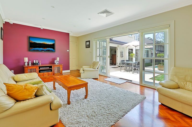
Something close to my heart & my styling -colour design business Verandah Home & Garden Living Solutions is helping my pre-sale property styling clients in getting their place on 'The Path to Sold'!
Nothing can affect your property more than it's presentation when getting prepared to put it to market to sell. Presenting your home to its optimal level means starting from the curb and making your way in... both the exterior and interior need to work together in order to meet market expectations, to get your marketing campaign, agent appraisal, inspection footfall and ultimately offers on your property & SOLD!
Hope you enjoy these little tid-bits on curb appeal - part 1; more to follow in several more parts in the next coming days...
.
If you or someone you know needs a design professional in preparation for selling a property be it owner occupied or tenanted - then be sure to contact me, Sarah, at Verandah Home & Garden Living Solutions, info@verandahhomeliving.biz for examples of our work please visit www.verandahhomeliving.biz Look forward to helping sell your property.
Enjoy,  
 
 
images and sub text from bhg.com

15 February, 2013

OPEN for Inspection...


So somehow this week in my midst of Verandah & Palatial craziness - I missed my Mid Week House Snoop - that I love simply because I am truly a nosey parker and love sharing it with you!
So instead I have a Palatial Exclusive - 'Open For Inspection' purely due to missing Wednesday and also being Friday everything that anyone wants to organise to see property-wise is open for inspection on Saturday!
[Saturday, 16 Feb 2013 12:00 pm- 12:40 pm]
So this pseudo House Snoop - Open for Inspection does not let you down! This is a truly stunning property, worth of Palatial Living standard and not too far from my humble back door. Located in Turramurra on blue ribbon side, Worcester St, it does not disappoint. The owners are even showcasing Palatial Living & Verandah colour schematics [with exception of the media living room  feature wall... although they [the owners] didn't call on me to help them with colour consulting what can I say!]. However looking at the bigger picture the gardens, the home, the position and overall feeling of this gorgeous home is not only stunningly beautiful but quite sublime and ready to make it someones home again. 
A Thank You to Paolo Lorenzutta, Licensee & Principal, from Richardson & Wrench Turramurra [who is also the agent we bought our wonderful Wahroonga local home from] whom I spoke with this week and looking to use my - Verandah Home & Garden Living Solutions styling services across the properties his agency will represent on the North Shore for pre-sale property styling
Looking forward to making a difference in footfall, marketing campaigns, vendor's bottom-line & making someone a gorgeous place to call home x 
Enjoy, 

Agent's Blurb... Richarson & Wrench Turramurra

Contact 
OPEN for INSPECTION:  Saturday, 16 Feb 2013 12:00 pm- 12:40 pm

ELEGANT & STYLISH - BLUE RIBBON EASTSIDE POSITION


This beautiful two storey double brick family home offers space and style and is located in a highly sought after culdesac position in Turramurra and will appeal to buyers seeking one of the highest quality homes in the area. With a fantastic open plan layout, the home has been designed perfectly for indoor or outdoor entertaining.
The home comprises:
- 4 spacious bedrooms (WIR to master) plus study
- 4 bathrooms (Master & 2nd with ensuites)
- Formal lounge & dining areas open onto the beautiful entertaining courtyard overlooking the in-ground pool
- Magnificent open plan Caesar Stone Kitchen with top quality stainless steel appliances plus meals area
- Large separate family room with parquetry flooring
- In-ground pool with frameless glass fencing and mature Magnolia plants
- Landscaped gardens and manicured hedges surround the property which also includes a separate sandstone courtyard
- Ducted R/C Air conditioning plus double garage
- Walk to station, shops & schools

Property Features

Alarm SystemClose to SchoolsClose to ShopsClose to TransportAir ConditioningSecure ParkingBuilt-In Wardrobes
images & subtext via domain.com.au and Richardson & Wrench Turramurra

12 February, 2013

Your Colour Questions... Sorted- Part 2.


 Light & Colour Effects
Q: How should lighting play into my color choices?
A: Daylight is the best light in which to test colours but even daylight isn't consistent. Northern light is warmer, southern light is cooler [in the Southern Hemisphere - for you in the Northern Hemisphere simply reverse this]. Plus, different light bulbs give off different light colour. 
Test paint in large swatches on your walls and examine the options at different times of day with different light fixtures on. Drape fabric swatches over pieces of furniture for assessment, as well. Consider the time of day you'll be using the room most frequently. Pick a color that looks best during that time so that you'll be able to enjoy it. This is essential to get the 'best' out of how you will view it.


                                                 House-Wide Colour
Q: How do I unify all the rooms in my house?
A: Fashion a whole-house palette by keeping major furnishings and architectural finishes in neutral hues. Employ the same trim colour in all rooms. For room-to-room transitions, use the same hues throughout your home, but vary proportions from space to space. Use one colour on the walls in the living room and use the same colour for accents in the dining room, for example. This is certainly where a professional colour consultant or interior designer can add so much value to your project and the choices you make. 


                                                    Order of Business
Q: In what order should I select the colours for a room?
A: If you're renovating or building - then pick your wall colour last. Hard Finishes, Electricals, fittings & Case goods as well as some fabric options can be more limited to their finish & colour range. Pull the room together with what's available to you and your budget first, then go to paint colours.


                                                      Neutral vs. Colour
Q: How do I decide between putting a neutral or a colour on my walls?
A: A rule of thumb: Neutral walls make room for rich furniture and vibrant art work, whilst Colourful walls rest well behind neutral furnishings or accents of similar or complementary tints & colours. Balance for the eye - no squinting either way!


                                                          White on White
Q. I want a white room, but how do I pick the right shade of white?
A: Stay away from super whites. Not only do they make you squint they also give many headaches to the intensity of the saturated brightness [chroma value] they hold. So always look for something with a little grey or [a red based] cream in it. You'd be surprised how much colour [hue] you can add to pure white and still have it read as white on the wall. And will provide for a fresh living environment. 

------------------------------------
Now hopefully the majority of your basic colour questions & answers are covered!
If not, and you need a professional colourist, a soundboard and good helping hand to bring the colour scheme together, then just pick up the phone or drop me a line  - and we can arrange a convenient time to get your colour groove, at your home or office,  happening! 
Call [me] Sarah on [+61] 0402 304 602, or email me at sarah.verity@verandahhomeliving.biz we can also get your covered via e-colourdesign email - post and skype. For more details on the services we offer and previous project work please visit our website www.verandahhomeliving.biz
I look forward to hearing from you - I always have time to chat about colour!
Enjoy,


images via pinterest via @palatialliving pinterest

11 February, 2013

Your Colour Questions.... Sorted! Part 1


Your Colour Q&A's - Sorted!
Choosing the Right Colour
Q: How do I know a colour is right for my room?
A: Let the idea go that there is one right color or you might fail to recognise some very beautiful possibilities for a space. Many colours you think are wrong, simply create a different effect and may not be the desired the effect you want to achieve. That's why there are so many tints and saturation of the 'same' colour in the paint charts. This is where a professional colour designer consultant can really help and take the stress out getting that perfect tint or shade of that one colour you just love!


Use & Repeat
Q: How do I use my colour choices in a room?

A: Use each colour at least twice. 
Repeat your wall colour in the form of pillows or other accents to unify your theme.                                                             

 Lounge Dilemma


Q: I own a dark brown sofa. How can I keep the piece from dominating the look of the room?


A: I love brown- chocolate lounges too. You can put any colour of pillow on it. Keep the walls lighter, anchor the space with a light-color textural rug, and limit other dark browns to an accent chair or a picture frame. Bring in mid-tones such as hot or shades of coral pink, red or vermilion, and teal or jade. 

                                                    Small Space & Colour


Q. I love colour, but have a small house. How can I best use colour in my small spaces?


A: Patterns have more visual weight than solids and can make small rooms appear even smaller. Enlarge the perception of the space by placing simply patterned pillows on a plain sofa lounge and use textured solids to add interest without busy-ness.

Make My Bedroom 'Me'


Q: How do I make my bedroom feel a little more like "me"?


A: Use favorite patterns and motifs in your desired colour scheme. Love pretty florals? Look for a floral comforter and draw your colours from that. If modern geometrics draw you in, start with solid bedding and add throw cushions or pillows with geometric shapes - then layer with subtle self textures.

                                                  Bold Colours & Patterns - Ready!


Q: I'm ready to be bold with colour and pattern, but how do I make sure I don't go over the top?


 A: When both patterns and colours are bold, use less of each so as not to overpower a room. Choose accents colours from the patterns to accessories, try to keep part of the decor anchored with a plain - solid colour, i.e walls, floor or lounge - wherever you're not using a pattern.

----------------------------

I have a lot of people and clients ask me many colour & styling related questions and know how helpful it can be when you find that answer to a burning question you've had for a while! Hopefully the above Q&A's details have helped you find a solution to you decorating dilemma! If not please don' hesitate to contact me for professional design styling & colour consultancy at 
sarah.verity@verandahhomeliving.biz 
or via web 
www.verandahhomeliving.biz 
If you're located outside of Sydney Australia I can accommodate your needs via 'e-colourdesign consultancy' or simply a 'room-in-a-box via the post' - I can help you!
I am working on Part 2 Colour Q&A for tomorrow's Palatial Living post - stay tuned. 
Enjoy, 


images via pinterest - via palatial living pinterest  - via tumblr


LinkWithin

Related Posts with Thumbnails