Showing posts with label Elle Decor. Show all posts

29 April, 2013

Palatial House Love...

 
House on Oyster River (Cape Cod). Polhemus Savery Dasilva.
 
Incredible setting. Aquidneck Properties  
 
 
Atherton residence, Utah. Markay Johnson Construction.
 
 
Scott Currie’s Hamptons home in Elle Décor.


Vineyard farmhouse, VA. Barnes Vanze Architects.
 
 
Amongst my increasing addiction to pinning - great to do when waiting for pretty much anything... I recently came across a couple of wonderful Pin boards that I have now started following, see pinterest for 'Alex Corvin' pin board - 'Home', and Suzanne Boy,  and wanted to share these stunning Palatial Homes with you that I have added to my 'House Love' Pin board HERE Palatial Living Pinterest - you can also follow my pins via Twitter @PalatialLiving
 
I'm sure if you too subscribe to the Palatial Living aesthete and ethos that you'll fall in lobe with these houses too!
Enjoy,


images via pinterest - alex corvin, Suzanne boy and elle décor, tumblr.

16 March, 2012

Fab New Gorgeous 'Palatial'-Style Online Store - 'Dalani Home&Living'...


Have you heard about this gorgeous stylish [new] online store 'Dalani Home & Living'??
Well if you haven't - then you have now... Take a look at just a smattering of their beautiful offerings [below] from their website 'Dalani Home & Living' CLICK HERE. On their main page you can sign up for  stunning e-newsletters, online store offers, and tune into their stylish helpful online magazine, where they showcase different decorating approached one of my favourites and many other Palatial Living fans' is the 'Hampton's Look'... as shown in Dalani's online magazine....


I love sharing and promoting all fab finds and this is no exception in the style & design community - little background for you on Dalani and it's founder, Delia Fischer [a long time editor of Elle & Elle Decoration], and the company set up...


[for a larger reading viewer click on the image]


[for a larger reading viewer click on the image]


And finally here's a great article & interview from Jen Bishop over at Interiors Addict on Dalani Home & Living CLICK HERE  from 10th December 2011, last year.


I'm sure you'll find something special online just for you...
better yet it's delivered to your front door with style! 
Enjoy,

-----------------------------------
images via dalani home and living, dalani.com.au, interiors addict by jen bishop.
Note. Dalani Home & Living did not pay for, or endorse this blog post 

04 April, 2011

Loving... Red | White & Stripes.


Most people who know me - do know that I have a penchant for stripes, ticking - wedgewood, micro, you name it the stripe - I will fall for it!! So it was by no surprise on one of my image gathering journeys that I was completely inspired when snooping around in a House Beautiful 'House Tour' design consultant Ellen O'Neil's weathered home in Bridgehampton, New York. Where she successfully showcases the softer side of red, and by using a restricted palette really does allow for stunning & striking clean results...
Here I have gathered a few of my favourite red-white with touches of reduced red - pinks, and have been inspired with my Surface Design diploma class [at ISCD]- their latest brief is the 'Deck Chair Struipe' so here's my little play with red - white stripes and reversing it out, all in this little collage for you.
Do you love red-white and stripes?
Could you hold yourself back with a restricted colour palette in you home?
Let me know - I'd love to hear from you.
Enjoy,


images via house beautiful, coastal living, elle decor, tumbler, ys voice

15 March, 2011

Ever Thought of... A Dash of Fresh Green?


There are so many ways to add colour into your interior space - here today I fell in love with these 'green rooms'. With their bold use of colour blocking, oversize pattern & print - playing with the scale, and playing with the placement - like gingham wallpapered ceilings! How fabulous!
Large or small spaces in each image you can see how the use of green is used in varying balances often tied back with white or off-white, tints & shades of green, and 1 accent colour to break up the focus of the colour blocking. Where natural timber finishes have been used to create a surface texture, white finished furniture may have been used in other spaces and created more dominance & contrast of shape/ depth.
Could this be a hue of green you might want use soon?
I know I love the idea of the wallpaper patterned ceiling!
Enjoy,


images via elle decor, house and home, my home ideas, house beautiful, bhg

10 March, 2011

Instant Art in Fabric Framing...


If you're like me you have probably a few piles of favourite fabrics in a cupboard, box or sewing room somewhere. Ever thought about all that gorgeous fabric, or tablecloth, that might be - one of these two things...
a} much too nice to cut up [It feels so awful to cut up something so pretty even for a lovely cushion!] OR
b} just didn't know what to make out of it because you might not have had enough to keep going...so it continue to sit there?
Here's a thought - so why not think about framing it?  It's  a quick and inexpensive project that I love, it can bring instant colour, a custom look to your decor, and can be a great update to any room in your home! And depending on your fabric's look - can be for a living/ dining space,  a master bedroom, home-office or a child's room... the possibilities are endless!

Creating Simple Fabric Artwork
In its most simple form, you can just cut a piece of fabric to fit a frame, stretch and affix it to a cardboard backing, and place it in a mat and frame to create instant artwork. In order to choose the perfect spot to cut the fabric, use the clear glass from the frame itself as a guide. Slide the glass around the fabric until you find an area of the pattern that fits perfectly in the frame, then trace around the glass and make a marking on the fabric. Add a half inch [a couple of centimetres] to all edges to allow for affixing to a cardboard backing board, then cut out, mount and frame.
Alternatively you could also stretch the fabric over an inexpensive canvas - purchased from your local art&craft or variety store, and securing each side as you stretch the fabric over the canvas with a heavy duty staple gun. Make sure you check if your fabric has a directional print and you hang it accordingly - or it could be upside down!

This is something that you could try this weekend  for an instant wow!
Enjoy,
Miguel Flores-Vianna
images via canadian house and home, hub pages, elle decor via little green notebook, down & out chic - southern flourish, anne becker

22 December, 2010

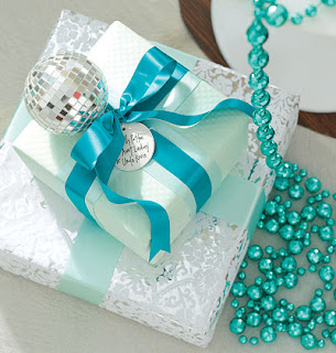
Loving Pale Blue & White Festive Decor...


Just a few of my favourite pale blue & white Christmas [inspired] images that I have been collecting lately that I wanted to share with you.
Can you tell that I love this theme too... Maybe for next year? Enjoy,


images via homelife.com.au Australian Country Style; my home ideas, elle decor, coastal living & country living.

07 December, 2010

Christmas & Cocktails...


 Although not for everyone - I do love this 'non traditional' Tiffany Blue & Azure, Silver & White inspired Christmas tree and all the decor with it... 
It carries a wonderful Palatial contemporary edge, with a touch of nostalgic romance from the Late 50's - Early 60's, I could almost see a set design from Mad Men with Betty Draper about to bring the cocktails & drinks trolley in for a Tom Collins or a Dirty Martini, with a few nibbles & crackers for a few friends & associates for the festive season!
Enjoy,


images via Elle Decor

04 October, 2010

A Golden Outlook...


 Granddaughter of Estee Lauder, & Creative Global Director  Aerin Lauder
Zinterhofer’s Manhattan apartment. Still-life paintings and an 18th-century
 landscape in an East Hampton living room; the brass-and-walnut cocktail
 table is by Willy Rizzo. Photographer: Simon Upton
 Extract from Elle Decor - 'Lauder’s Manhattan apartment is even more reflective
of the tweaks on tradition that she enjoys. The entrance hall, library, and
living and dining rooms were designed by French decorator Jacques Grange.
These spaces, in neutral shades of beige and gold offset by deeper tones, reflect
her love of French furniture from the ’30s through the ’50s and are studded
 with pieces by Armand-Albert Rateau, Alberto Giacometti, Jean Royère,
 and Jean-Michel Frank. Here the shots of color come in surprising forms.'
 Lately I have noticed I am being drawn to earthy ochres, mustards & golden hues. After closer inspection of my framed art exhibition posters, prints, cushions and accessories - orange hues and it's cousin hue - mustard, seem to be an unconscious choice of accent colour for me, when paired back with blues, whites & neutrals, red tones and pinks!
Who would have known! It may just be another subconscious aesthetic link to my love of Australian art, and Australian Indigenous art that am attracted to the colour mix.
Have you noticed there's another colour in your palette waiting in the wings? Is there a colour that you seem to be drawn to more often than not -


One of my favourite Australian artists', Sidney Nolan, paintings from his
 'Ned Kelly' series - titled 'Ned Kelly' 1946 enamel on composition
 board 90.8 h x 121.5 w cm . Gift of Sunday Reed 1977
Sidney NOLAN  b.1917 Carlton, Victoria, Australia – d .London, England 1992
This' Ned Kelly' print /exhibition poster form the Sudney
Nolan NGA hangs in my home office.

What does Orange as a colour mean?
Orange combines the energy of red and the happiness of yellow. It is associated with joy, sunshine, and the tropics. Orange represents enthusiasm, fascination, happiness, creativity, determination, attraction, success, encouragement, and stimulation.
To the human eye, orange is a very hot color, so it gives the sensation of heat. Nevertheless, orange is not as aggressive as red. Orange increases oxygen supply to the brain, produces an invigorating effect, and stimulates mental activity. It is highly accepted among young people. As a citrus color, orange is associated with healthy food and stimulates appetite. Orange is the color of fall and harvest. In heraldry, orange is symbolic of strength and endurance.Orange has very high visibility, so you can use it to catch attention and highlight the most important elements of your design. Orange is very effective for promoting food products and toys.While red is associated with fiery heat, orange is associated with the benign warmth of the sun.
 A dynamic color to be sure, orange offers a more thoughtful control than explosive red. Curiosity is a driving characteristic of orange, and with it comes exploration of new things. Put some orange in your life when you want: Dark orange can mean deceit and distrust. Red-orange corresponds to desire, sexual passion, pleasure, domination, aggression, and thirst for action. Gold evokes the feeling of prestige. The meaning of gold is illumination, wisdom, and wealth. Gold often symbolizes high quality.

* to spice things up when you feel time is dragging
* to become more involved in something
* to increase creativity
* relief from things becoming too serious


LinkWithin

Related Posts with Thumbnails